Pandomo is one of the range of products that the Paintsmiths group is most famous for and proud of. It has a way of transforming a space completely and boldly. It also lends itself to numerous interior design styles.
The question we often receive is how to incorporate a texture wall within your space with flat paint colours? We had a chat with MI Design, an international interior-architectural design firm based in Port Elizabeth and a frequent user of Paintsmiths Pandomo in domestic and retail spaces and their advice was too good not to share.
We agree with them when they say that there are no absolute rules when combining a texture wall like Pandomo with flat paint. “… of course, otherwise there would be no art and everyone’s spaces would look exactly the same.”
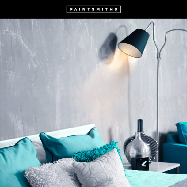
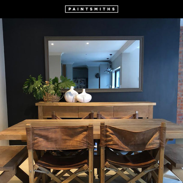
Colour combinations evoke emotions. It can make a room feel warmer or cooler, larger, or smaller. For a pleasing contrast, we would suggest pairing a bold colour/dark neutral Pandomo accent wall with light and neutral greys/beiges. This also depends on whether you want to achieve a warmer(beige) or cool and calm(greys) atmosphere.
Alternatively, if you prefer more colour in your space or would like the colour combination to “blend”, add flat colour walls that are the same colour as your Pandomo wall but in 2 or 3 shades lighter. This will highlight/accentuate the lighter tones visible in the Pandomo wall.
If all else fails in the famous words of Leonardo da Vinci: “Any colour is more distinctly seen when opposed to its contrary: thus, black on white, blear near yellow, green near red, and so on.”